Saturday, July 31, 2010

A first look at shot location visualizations

On the subject of investigating play-by-play data for the first time, Ryan J. Parker over at www.basketballgeek.com has provided the NBA stats community with great NBA play-by-play data between the 2006-2010 seasons. I downloaded that data this past week for the first time (even though I've known about it for awhile now), and I've become inspired to take a deeper look at the entire dataset.

Using a macro that I found via Google called "Merge CSV files," I was able to combine all of the play-by-play data in single spreadsheets, one for each of the four seasons that Basketball Geek has available.

I then filtered each of the spreadsheets by etype, and chose shot, in order to return all plays in each season that were shots. I took each of these filtered datasets combined them into a fifth Excel file to list all shots that happened in the past four regular seasons of the NBA (turns out to be 763,444 shots, which unfortunately does not agree with Basketball-Reference.com's 796,617 shots, something that I will ignore for now due to the sheer amount of entries here).

This shots data has everything from players on the court at the time, who the assist went to, who blocked the shot if it was, the result (made or missed) type of shot (ranging from 3pt to driving layup to pullup jumper to running bank shot), and, get this, the X and Y coordinates of each shot. And with a general knowledge of filter and pivot tables and the like, I've come up with a lot of interesting findings.

Using the same data that I've compiled, Jeremy Greenhouse over at The Baseball Analysts was able to chart visualizations of shot locations. I decided to give this a try myself, knowing a little bit of R from class.

With the help of Jeff Zimmerman's Advanced Graphing Techniques series over at Beyond the Box Score, I was able to write the R code to map contours and heat maps based on data.

Here's some of the preliminary images I came up with (without axes labels and titles, mind you. I've just tried these last night, and this is my first look):


Carmelo Anthony Shot Location Frequency (2006-2010)

Danny Granger Shot Location Frequency (2006-2010)
Dirk Nowitzki Shot Location Frequency (2006-2010)

Dwyane Wade Shot Location
Frequency (2006-2010)

Kobe Bryant Shot Location
Frequency (2006-2010)

LeBron James Shot Location
Frequency (2006-2010)
Tim Duncan Shot Location Frequency (2006-2010)

NBA Shot Location
Frequency (2006-2010)


NBA Shot Location Heat Map and Expected Points per Shot (2006-2010)
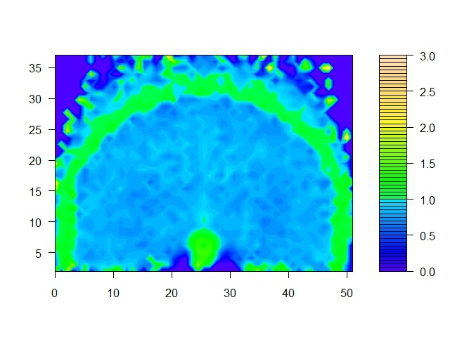
Please note that the scales are all off (except the last one) so you probably shouldn't compare the colors between player graphs (the color palette scale actually refers to a raw count of number of shots taken, so it's not standardized by minutes played or whatever. The last one refers to expected points per shot that I calculated). The X and Y axes are in feet, so consider that the center of the basket is at coordinates (25, 5.25).

However, you can definitely make sense of the graphs and tell the tendency of where some of these superstars/stars tend to shoot. Carmelo and D-Wade fans know that they love their hot spots, and these graphs confirm their tendencies. Dirk and Kobe basically can shoot anywhere on the court, while Granger loves to go at rim or take 3s not on the baseline. Tim Duncan is your classic post-up player, so he hangs out near the bottom of his frequency graph there.

Some things to add on to these graphs when I make them in the future:
  • title and xlabel and ylabel and etc.
  • Superimposed outline of 3 pt line and key lines and etc.
  • Legend for made and missed shots possibly?

And other graphs to take a look at in the future:
  • Some way to standardize shot location frequency scale (shot percentage? as a fraction of total NBA shots in that location? or as compared to the league average tendencies?)
  • Home vs. Away splits
  • 1st, 2nd, 3rd, 4th quarters, last two minutes of regulation + overtime
  • Field goal % and effective field goal %
  • Expected points per shot for players (are players taking shots where they are successful at?)
  • Types of shots, by NBA and by player
  • Assisted shots (Nash-assisted shot locations, NBA assisted shot locations)
  • Offensive rebound locations (need X-Y coordinates of shot in previous play before offensive rebound)
  • Any additional suggestions

Anyway, I have a short rest of the summer ahead of me to generate more of these graphs and take a look at some of these in greater detail. There's definitely a lot more stuff and analysis to do with a huge database of NBA play-by-play data categorized by a lot (but not everything). But right now, generating heat maps and these visualizations interest me the most. Should be fun.

Thursday, July 29, 2010

More graphs: Play call% by yard line for each down

Yesterday, I looked at pass locations, run directions, field goal distances, and FGA% vs. Punt% by yard line. The following graphs, however, are far more interesting. They show the play call %s on each yard line, and there's a graph each for 1st down, 2nd down, etc.


For the 1st down graph, the first thing to notice is that rushes tend to be called much more than passes on 1st down when you start off with terrible field position. This is probably due to the fact that your QB is set up in the end zone and in order to avoid a safety, teams always run the ball first and play it safe. Consistent with conventional thinking. The second thing to see is that passes on 1st down occur more often than rushes mainly between the 50-70 yardline range. Interesting.


For the 2nd down graph, things are a little bit more desperate here, so pass% is > than rush% for nearly every yard line EXCEPT when you're stuck in your own end zone or when you're 2nd and goal. In only those situations do NFL teams, on the aggregate, tend to rush the ball at a higher % of the time. This is also consistent with conventional thinking.


For the 3rd down graph, pass% is >>> than rush% in nearly all cases, except when you're 3rd and goal and short in the redzone. It's your 'last' chance to get a 1st down, so passing the ball in order to get more yards is the most common play here. This is also consistent with conventional thinking.

The 4th down graph is very interesting, it's similar to the FGA% vs. Punt% graph I posted yesterady. It seems that at around the 35 yard line, 4th down plays are a toss up between punt, FG, and "go for it" pass/rush play, and likely depending on the game situation, such as time left on the clock or yards to go.

A few things to note: None of these graphs indicate yards to go, and that is obviously a huge determining factor on whether the offense decides to pass, rush, punt, etc.

Finally, an interesting thing I found. There are three occurrences in 2008 in which the offense elected to punt on 3rd down (haha).

Dec. 18, NE@BUF
(5:16) (Shotgun) M.Cassel punts 57 yards to BUF 2 Center-D.Koppen downed by NE-S.Morris. Quick kick.

Dec. 18, NE@BUF
(1:18) (Punt formation) C.Hanson punts 41 yards to BUF 19 Center-L.Paxton. F.Jackson pushed ob at BUF 49 for 30 yards (M.Slater).

Nov. 3, PIT@WAS - (2:39) M.Berger punts 48 yards to WAS 25 Center-J.Retkofsky. A.Randle El pushed ob at WAS 30 for 5 yards (An.Smith).

All three happened in the 4th quarter with a few minutes left in the game. The Patriots did it twice in the game against the Bills when the Dolphins won on the same day and kicked the Pats out of a playoff berth: http://sports.espn.go.com/nfl/recap?gameId=281228002 and one of the punters was Matt Cassel.

The Steelers were leading the Redskins 23-6 with 2:39 in the 4th qtr when they punted on 3rd down.

Wednesday, July 28, 2010

First graphs: Pass locations, rush directions, field goals, and punting

As promised, here's a first look at some of the graphs from Burke's PBP dataset, specifically the 2008 spreadsheet. The first graph here looks at the distribution of pass locations in the 2008 NFL season. Passing up the middle, short or long, occurs less frequently than passing left or right. Passing right occurs more frequently than passing left, due to the fact that most quarterbacks are right-handed. Throwing over your shoulder requires more arm strength and gives the defense more time to adjust and get a good look to get a pick. In short, throwing left is common but is a slightly more risky play for a right-handed quarterback.

Edit: Wow, didn't realize I mixed up the guards and the tackles. Oh well.
This graph shows the distribution of run directions in the 2008 NFL season. This time, running up the middle occurs more than twice as often as any other direction, likely also because it is a "safe" direction to run the ball (behind the protection of the full force of your offensive line). Short yard attempts are usually the least risky plays, but also do not gain as much reward as an outside run if executed correctly.

Here is a graph showing field goals by distance (I used yard line and added 17 yards to each). Few field goals are blocked or no good at the 44-yard distance, but once you go beyond there, the number of successful field goals drop faster and faster.

Here is a graph showing the field goal and punt percentages on 4th down. This shows that the 36 or 37 yard line is approximately the breakeven point in NFL teams deciding whether to punt or to go for a field goal (which is around 53 or 54 yards for field goal distance). What might be more interesting to see in 4th down situations is how often NFL teams tend to go for it on 4th down depending on yard line, relative to punting and field goals, etc.

Next time, I'll take a look at play calls in the 2008 NFL season and see how they stack up against one another (pass vs. rush vs. punt vs. field goal vs. etc.) depending on yard line and on what down it is.

Tuesday, July 27, 2010

A first look at NFL PBP data

I will use this blog to present, discuss, and archive some of my thoughts on research into sports, particularly baseball, basketball, and football.

Thanks to Brian Burke of Advanced NFL Stats, we now have freely available play-by-play data for NFL seasons 2002-2009. I've taken the 2008 data set and added additional columns to capture other characteristics of each play, categorizing things like pass/rush plays, fumbles, types of penalties, types of scores, even run direction, pass location, intended receiver on complete/incomplete/intercepted passes, etc. This is thanks to the help of the valuable comments left by contributors at Burke's website.

Here are the original columns in the 2008 spreadsheet:

gameid (example: 20090201_PIT@ARI)
qtr
min (minutes left of regulation, so counts down from 60)
sec
off (who's on offense)
def (who's on defense)
down
togo (yards to go)
description (description of the play)
offscore
defscore (offscore and defscore switches after a change of possession)
season

description is the key attribute here where we can use Excel formulas to figure all sorts of information out. To see how much info description contains, check out this example:

(:18) (Shotgun) K.Warner pass short middle intended for A.Boldin INTERCEPTED by J.Harrison at PIT 0. J.Harrison for 100 yards TOUCHDOWN. Super Bowl Record longest interception return yards. Penalty on ARZ-E.Brown Face Mask (15 Yards) declined. The Replay Assistant challenged the runner broke the plane ruling and the play was Upheld.

Anyway, I've added additional columns to the 2008 spreadsheet. Here are the additional attributes extracted from description I added using the formulas that were posted in the comments (and some of my own and modified ones):

play type (example: pass)
play subtype (example: incomplete)
play call (example: rush, when play type is fumble)
yards gained
fumble?
fumble result (either fum Recov or fum Lost)
penalty?
penalty type
penalty decision
challenge
challenge decision
nullified TD (if TD was reversed because of challenge)
clean description (without formations, time left, etc.)
description w/o reversed plays
score type
passer/runner (who threw the ball or who rushed the ball)
run direction (right end, right tackle, etc.)

pass location (deep middle, deep left, etc.)
pass complete to
intended receiver on incomplete pass
intended receiver on interception

I haven't cross-checked all of the data to see if the formulas are 100% correct (the PBP data itself might have a few errors, missing plays, incorrect entries, etc.) but I am sure the ones highlighted in red have shown faulty results. Still, with this spreadsheet, you can figure out the answers to all sorts of questions if you are pretty savvy with using filter and pivot tables (they're very easy to learn). For instance, you can figure out simple questions such as how often passing attempts vs. rushing attempts for any combination of down, yards to go, and yard line using filter and pivot tables. If you dig even deeper, you can sort by team as well (the spreadsheet needs to be fixed up a bit), and see which teams chose to pass for highest % of plays or chose to rush for highest % of plays. Run direction and pass location are very useful attributes, as you can figure out how run directions are distributed in the average NFL game in 2008. Maybe we can even find out if fumbles occur more often if rushed up the middle, or if less fumbles occur in the shotgun formation than not.

I played around with pivot tables and filtering on Excel, and came up with some preliminary graphs. Nothing substantial or revolutionary here, but definitely interesting to look at and a good initial step to looking more at this data. In my next post, I'll take a look at some interesting graphs from aggregating the data (of course, only for the 2008 season).