Where Assisted Shots Are Made (2006-2010)

Where Blocked Shots Are Missed (2006-2010)

Hmm... these visualizations aren't very telling. It's clear that most shots are blocked near or at rim, while the assisted shots location frequency looks distributed almost exactly the same as the NBA total shot location frequency. Counting statistics don't tell the full story about assisted shots vs. unassisted shots, since a high percentage of them will be at rim anyway. Looking at percentages per field goal per location would return a more interesting plot. I plotted the same graphs, except with assists / field goals made and blocks / field goals missed to see the percentages of field goals made that were assisted as well as the percentage of field goals missed that were blocked:
Assists/Field Goals Made by Location (2006-2010)

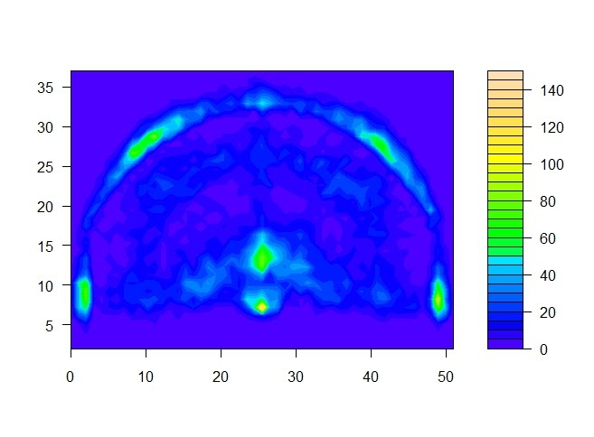
Blocks / Field Goals Missed by Location (2006-2010)

Interestingly enough, a very high percentage of 3 pointers are assisted, and almost 100% of all corner 3s are assisted. If you consider that the basket is at (25, 5.25), the locations with the lowest percentage of shots that are assisted are around the top of the key. (Note: changes to make in the future include the color scheme of the color palette and an outline of the 3 pt line, the key, and the basket. This is possibly the first graph so far that the basketball court is not apparent).
For the blocks per field goals missed graph, looks like a high percentage of shots near the basket are blocked, which makes sense. Notice the blips of yellow/green in the top left corner of the graph, about 30-35 feet from the basket. It seems that someone or a few players were blocked trying to take a long 3, and it just so happened to be in the same location. I looked it up. Two shots were missed at that particular location, and one of them was blocked (Donyell Marshall on Kevin Martin at 4,30). Another note for the future: remove statistical noise wherever possible.
Next, I took a look at the shot location frequencies of different teams:
LAL Shot Location Frequency (2006-2010)

PHX Shot Location Frequency (2006-2010)

ORL Shot Location Frequency (2006-2010)

HOU Shot Location Frequency (2006-2010)

CHI Shot Location Frequency (2006-2010)

ATL Shot Location Frequency (2006-2010)

IND Shot Location Frequency (2006-2010)

NJN Shot Location Frequency (2006-2010)

This time, I tried to standardize the scales (made the maximum of any # of shots in any location to be 150) but again, it's not completely standardized because different teams took a different number of shots over the course of four seasons. Still, there are some trends you can see here. The Lakers, Suns, Magic, and Rockets distribute shots across the floor pretty well, taking a high percentage shots at high percentage locations such as at rim and the corner 3. The Bulls, on the other hand, do take a lot of long 2-pointer shots in comparison, an inefficient location to make buckets. The Hawks post up quite a bit as well as lay up and dunk at rim, as do the Pacers. The difference is that the Pacers take a higher percentage of 3 pointers, and the Hawks take a lot of long 2s. The Nets also tend to take a lot of long 2s, but look more or less like the average NBA shot distribution.
Looking at the shot location frequencies of teams over a 4-year period does have its limitations. It might be more interesting to see those shot location frequencies change over time for a team, after standardization. Next time, it'd be more interesting to compare shot efficiencies by team to determine which teams are locating their shots in efficient locations and how successful they are, but for now, this is what I've got.

PHX Shot Location Frequency (2006-2010)

ORL Shot Location Frequency (2006-2010)

HOU Shot Location Frequency (2006-2010)
CHI Shot Location Frequency (2006-2010)

ATL Shot Location Frequency (2006-2010)

IND Shot Location Frequency (2006-2010)

NJN Shot Location Frequency (2006-2010)

This time, I tried to standardize the scales (made the maximum of any # of shots in any location to be 150) but again, it's not completely standardized because different teams took a different number of shots over the course of four seasons. Still, there are some trends you can see here. The Lakers, Suns, Magic, and Rockets distribute shots across the floor pretty well, taking a high percentage shots at high percentage locations such as at rim and the corner 3. The Bulls, on the other hand, do take a lot of long 2-pointer shots in comparison, an inefficient location to make buckets. The Hawks post up quite a bit as well as lay up and dunk at rim, as do the Pacers. The difference is that the Pacers take a higher percentage of 3 pointers, and the Hawks take a lot of long 2s. The Nets also tend to take a lot of long 2s, but look more or less like the average NBA shot distribution.
Looking at the shot location frequencies of teams over a 4-year period does have its limitations. It might be more interesting to see those shot location frequencies change over time for a team, after standardization. Next time, it'd be more interesting to compare shot efficiencies by team to determine which teams are locating their shots in efficient locations and how successful they are, but for now, this is what I've got.
Wow, very nice, Albert. Looks like you've worked on your R, though I'm not sure it's fair that you have a class that teaches it. I've never used the filled contour graphing capabilities to plot density functions, but I might have to take a look into how that's done. I like it. I'm starting to feel inspired me to go back to the NBA PBP data or take a look at that NFL data.
ReplyDeleteWell, it was a data mining course and the prof's stats program of preference was R, other courses elected to use Minitab or STATA and others. From there, I had to teach myself R on my own, but I definitely still have a lot to learn. Either way, your articles definitely inspired me to check out how to make these heat maps, so thanks for that.
ReplyDeleteIronically, my first thought after going through some of the PITCHf/x summit presentations was to look at the NBA PBP data rather than the pitch database, but I'll definitely take a crack at some of those in the future. I actually still consider myself a rookie at this... you know... sports analytics thing.
I'm glad you found my blog though (I'm just not sure how you did). Hopefully I can improve and continue publishing interesting findings. I'll be ecstatic if I can write articles anywhere near the quality of yours. Keep up the good work.
Well you've already done better visualizing the NBA data than I. If you get around to baseball, you're welcome to publish any research at The Baseball Analysts. Look forward to seeing what you have in store.
ReplyDelete